Web designing is related to the design of various websites displayed over the internet. It refers to the various aspects of the user experience of website development rather than the software development.
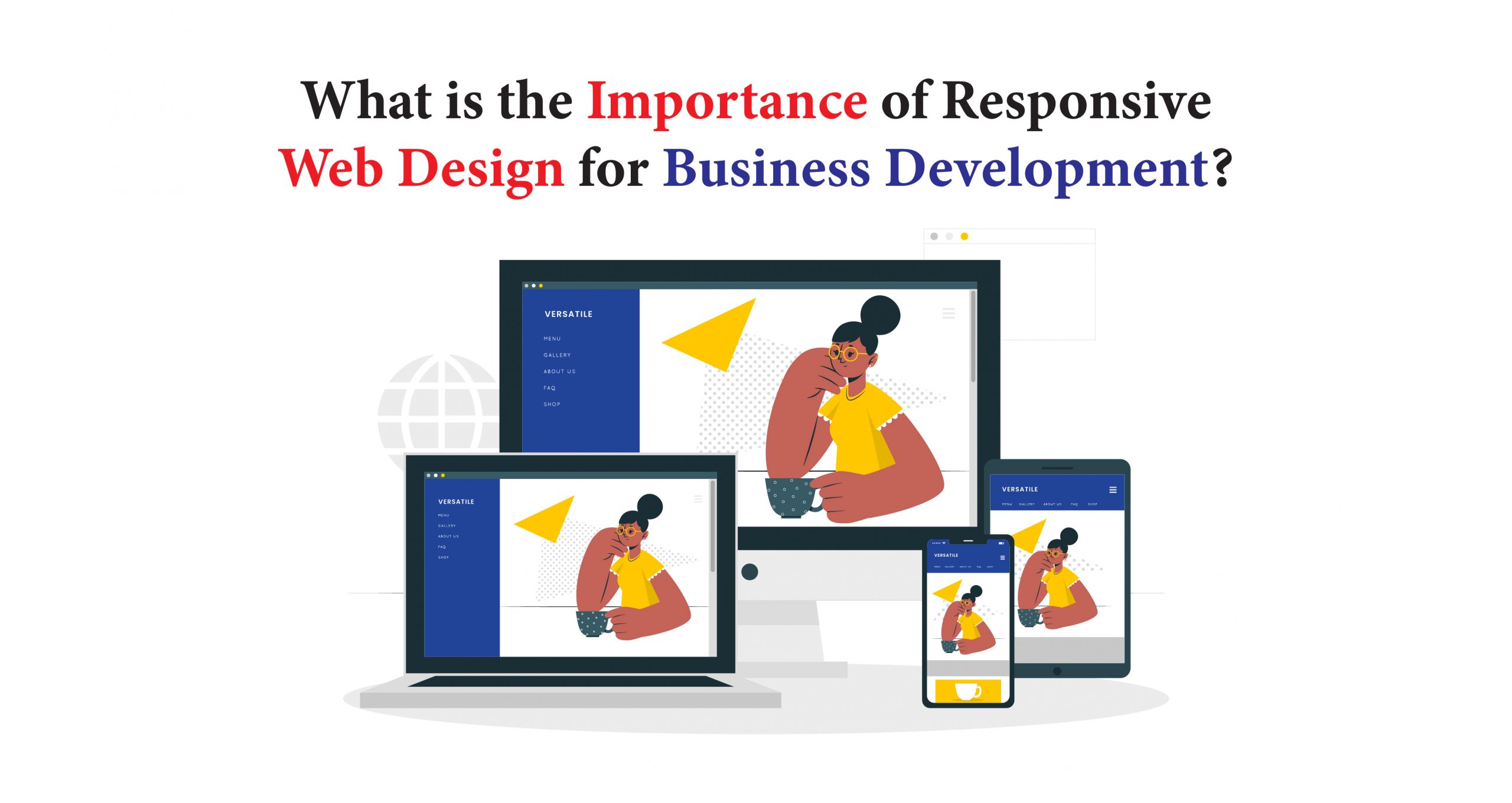
The most common methods for the purpose of website development are adaptive and responsive design. In the case of responsive design, web contents are dynamic. That means the contents are adjusting the spaces by moving dynamically depending on the different screen sizes. Being the top agency web design in Hyderabad, Versatile Mobitech offers responsive web development services.
Need for Responsive Website Designing for Business Development
Not everyone has a desktop or laptop. A positive and attractive mobile experience should draw positive output from the business. A website prefers mobiles first and thus wants to be rendered quickly. An outdated website never works on a device; the customer will have an idea about the business’s worth. Brand building depends on responsive web designing too.
A responsive website design from Versatile Mobitech draws the customer’s attention, and they think the company takes their customers seriously, thus helping to stay ahead in business. Customers love the customization process of their devices, i.e., Android or iOS depending on customer satisfaction. Analytics is a kind of goal which records the number of visitors viewing the pages.
Another advantage responsive web design has is the easiness of navigation control, easy accessibility, and fast. A fast-loading and custom web design in Hyderabad attracts more viewers, so the promotion of those websites will be high enough.
Unique content absorbs and analyzes a higher rate of responsive viewers. The duplicity of content determines the negative impact on these sites. The mobile users covered the most considerable eCommerce revenue. The engagement rate depends on the website the customers visit easily. Poor display of content negatively treating the customers.
From the SEO point of view of Versatile Mobitech, the mobile and tablet keywords help the websites improve their first-page visibility. New tabs, search bars, or the background catches many customers. Every high-end business module stated the increase rate of customers through mobile and tablets is getting higher gradually.
Lower cost management and better SEO in a single URL help them build connections with the websites. Responsive web designs analyze traffic and send data from one source only. Reliability also validates the factor. The different layout on different mobile or tablets enables adaptive web designing. The more the ranking gets better, the more exposure in the business will arise. Consistent growth and customer loyalty rate are high.
Nowadays, almost every business person prefers to design a website to take their business to the next level with the help of the best web development company in Hyderabad. In general, an eCommerce site is like the stores in a shopping centre where the initial feeling matters.
An alluring website from Versatile Mobitech will welcome clients, and efficient items will urge them to peruse and purchase. On the other hand, chaotic and disrupted stores will deter anybody from strolling in, and they will lose deals. However, try to hire Ecommerce website management services to get better solutions.
Refreshing your web-based business site is fundamental for supporting deals. These seven accepted procedures will take you through every region of the internet-based shop that you ought to refresh today for better deals.
That is excellent information for entrepreneurs who need to grow their internet-based income. The fastest method for getting results is to refresh your current web-based shop so that more traffic streams to the ideal locations and more deals convert for your organization.
To roll out a few positive improvements to your internet business webpage configuration, the following are seven accepted procedures that focus on the region of your site that make the most significant difference. Before long, you might be taking care of requests every day by the dozen!
Update Site Layout
Assuming you have a framework web-based business webpage, it’s brimming with adaptability and has a scope of instruments that you can use to make enhancements when required. This content administration framework allows you to effectively refresh your website format, which you will need for a crisp-looking web-based store. Now anyone can easily choose Ecommerce website management services to give a new dimension to their eCommerce site.
Ensure that your menu framework is as enhanced for your client as expected by consulting a website development company in Hyderabad. Make sensible menu titles with dropdown classifications that make looking through your site speedy and tomfoolery. Some 70% of independent ventures neglect to utilize clear invitations to take action, so ensure that yours pop.
Work on Checkout Process
One component of your internet-based store site should be improved-your checkout cycle with the help of a reputed website developer in Hyderabad. Unfortunately, truck deserting can mean substantial misfortunes for your organization. However, you can change your plan and content to keep new customers on track with a couple of minor changes.
Stand Apart with Original Product Descriptions
Your web-based shop can improve unique, imaginative item portrayals. Clients love to investigate an item before they choose to get it. In this way, invest energy redrafting every depiction to match your business’ tone and character.
Overhaul for a Mobile Experience
Your internet business site has a top new need to be completely portable responsive. When a guest shows up on your webpage to do some web-based shopping, it shouldn’t make any difference what gadget they use. Your site should change to suit any screen, so happiness is generally simple to see.
Feature New Promotions
To build your web-based deals consistently, make how you show your advancements a particular piece of your plan. Changing your site to upgrade direct items or limits is vital to closing those deals. Here’s the place where to put them on your online business site.
Be Easy to Contact and Offer Amazing Support
A hearty web-based business site makes it simple for clients to contact individuals behind the business. However, your internet-based deals rely upon adding ways of conveying what clients have generally expected. Ecommerce website management services allow you to keep your eCommerce site at the top place.
Gather and Showcase Recent Customer Reviews
If you need your internet business web composition to transcend the opposition, you want to gather and feature your best client surveys. This social verification is unimaginably valuable in persuading new clients to purchase your items and administrations.
Evolution of Responsive Website Design
The web design processes were very simple in the early 90s. Most of the websites used simple fonts, line spacing, simple headers as well as early tag lists in order to organize the collected information from the user base. The complex websites, whose functions were different from the simple websites, had to use multiple tables to control the page layouts of the website.
In addition to that, these sites had to bring the utility toolbars like sidebars and navigation that are well known today. Web developers in that period could create more creative, attractive, and playful designs for their websites with the help of CSS and many other technologies like Flash as well as JavaScript.
Between the years 1990 and 2000
Between the years 1990 and 2000, web designing patterns and experiences of the end-users had emerged at an increasing rate. Websites are starting to look more creative and organized from this timeline.
When the adaptation and implementation of CSS became much wider, website developers tended to spend a huge amount of time on typography, layout, and design. In spite of all these, it is true that these web developers did not have any worry about adjusting their contents to different screen sizes.
Most of the monitors of that time were 640×480, or 1024×768. Web developers found various types of ways in order to do work with their monitors or by adjusting the window size of the browsers. In the end, these kinds of activities lead to Responsive Web Design, as we are familiar with today.
Different devices require different ways of thinking as the people who will browse the contents will have their own specific goals as well as needs. Interactions that are done on various devices are indifferent to each other.
Like when we use mouse pointer and keyboard shortcuts to navigate content from a website, it is different from searching the content that is being searched by our fingers on mobile phones. Websites for both desktop platforms and mobile platforms are selectively designed for the specific usage of the end-user using Responsive Design. This shows how Responsive Design can boost the fluidity of the end-user performance.
Feel free to get in touch with us:
Email: sales@versatilemobitech.com
Visit our website: https://www.versatilemobitech.com/
Like us on Facebook: https://www.facebook.com/versatilemobitech
Subscribe
Subscribe to our blog and never miss our latest updates

Mobile App Development Company Dallas, Texas

Best Mobile App Development Company in UAE

DeepSeek – Everything You Need to Know About This

Why Your Company Website Should Be Responsive

 +91 970 193 0011
 +1 934 221 7261
 +971 55 316 6156


